Primary logo
Wordmark with the “API INFRASTRUCTURE” tagline. First choice wherever there is room: website, documents, proposals, events.

Brand kit
The official source for Avunzo logos, icons, colours, typography and social media assets — with the rules for using them. Free to download for partners, customers, media and designers.
Brand overview
Avunzo is the travel API infrastructure brand for Pakistan: one connection that lets online travel agencies, travel agencies, TMCs and corporate travel platforms sell flights, hotels, transfers, activities, eSIMs and airport services. Avunzo is operated by Voraal from Lahore.
The identity is built to feel like dependable infrastructure: a deep Avunzo Navy, generous white space, precise geometric lettering, and a single Avunzo Amber accent used sparingly — the dot of the logo, primary actions and key highlights.
The logo is custom lowercase lettering. Its final “o” is an open ring with an amber dot; that ring-and-dot is the Avunzo symbol, used on its own as the icon, favicon and social profile picture.
Logos
Each version comes in five colourways as SVG (screens, scalable), PDF (print) and transparent PNG in three sizes. Always use these files — never recreate the logo.
Wordmark with the “API INFRASTRUCTURE” tagline. First choice wherever there is room: website, documents, proposals, events.
The wordmark without the tagline, for small sizes (below 160 px wide), navigation bars, partner logo walls and co-branding.


Wordmark and tagline side by side, for wide, short spaces such as e-mail signatures, web headers and banners.


Symbol above the primary logo, for tall or square spaces: roll-ups, booth walls, presentation covers, merchandise.


The open “o” ring with the amber dot. Favicons, app icons, social profile pictures and very small spaces only.




Ready-made 2400 × 1200 PNGs for slides, documents and press.


favicon.ico (16/32/48) favicon.svg Apple touch 180 Android 512 All favicons (ZIP) 76 KB
Clear space & minimum size
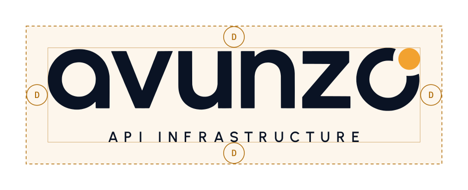
The unit D is the diameter of the amber dot. Keep at least 1 D of empty space on every side of every logo version — more is better.
| Version | Screen | |
|---|---|---|
| Primary logo (with tagline) | 160 px wide | 40 mm wide |
| Wordmark | 96 px wide | 25 mm wide |
| Horizontal lockup | 240 px wide | 60 mm wide |
| Vertical lockup | 120 px wide | 30 mm wide |
| Icon | 16 px | 5 mm |
Below the primary logo’s minimum size the tagline becomes unreadable: switch to the wordmark. Below the wordmark’s minimum, use the icon.
Logo usage
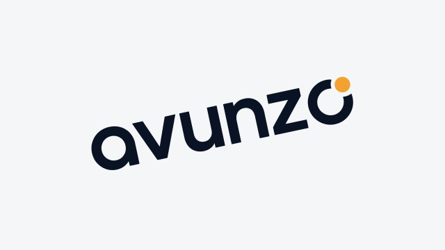
The logo works only when it is reproduced exactly. These examples cover the most common mistakes.






Colour palette
Navy and white carry the brand; amber is the accent and should cover well under 10 % of any layout. CMYK values are conversions for coated stock — ask your printer for a proof on critical jobs.
Avunzo Navy
Logo ground, dark sections, dark buttons
Avunzo Amber
The logo dot, primary buttons, highlights
White
Wordmark on dark, page surfaces
Ink
Headings and body text
Ink 2
Secondary text
Slate
Captions and meta text
Muted
Placeholder and helper text
Amber Ink
Amber for text and icons on white (accessible)
Amber Light
Hover state for amber
Mist
Page background
Cloud
Alternate section background
Line
Borders and dividers
Success
Confirmation states
Error
Error states
| Combination | Contrast | WCAG 2.2 use |
|---|---|---|
| White on Avunzo Navy | 18.6 : 1 | AAA — all text |
| Avunzo Amber on Avunzo Navy | 8.8 : 1 | AAA — all text |
| Avunzo Navy on Avunzo Amber | 8.8 : 1 | AAA — buttons and labels |
| Ink on White | 18.0 : 1 | AAA — all text |
| Amber Ink on White | 4.2 : 1 | AA for large text (18 px bold / 24 px) and icons |
| Avunzo Amber on White | 2.1 : 1 | Decoration only — never text |
Swatch sheet (PDF) Adobe ASE CSS variables SCSS JSON GIMP / Inkscape All (ZIP) 380 KB
Typography
Three open-source families, all free under the SIL Open Font License. The logo itself is custom lettering — never set “avunzo” in a font as a substitute.
Travel APIs, one connection
Headlines, display text and the logo tagline. SemiBold 600 – ExtraBold 800, tight tracking (−2 to −3 %) for headlines; the tagline uses SemiBold in capitals with wide tracking.
Search, price and book flights, hotels and airport services from your own platform.
Body copy, interfaces, documents and e-mail. Regular 400 for text, Medium 500 and SemiBold 600 for emphasis and buttons. 16 px / 1.6 line height for reading text.
POST /v1/flights/search
Code samples, API endpoints, technical labels and small uppercase eyebrows. Regular 400 and Medium 500.
| Style | Font | Size / line height |
|---|---|---|
| Display / H1 | Urbanist Bold 700 | 44–60 px / 1.05 |
| H2 | Urbanist Bold 700 | 32–40 px / 1.15 |
| H3 | Urbanist SemiBold 600 | 18–22 px / 1.3 |
| Body | IBM Plex Sans Regular 400 | 16 px / 1.6 |
| Small / caption | IBM Plex Sans Regular 400 | 13–14 px / 1.5 |
| Eyebrow / label | IBM Plex Mono Medium 500, uppercase | 12 px, +12 % tracking |
| Code | IBM Plex Mono Regular 400 | 13–14 px / 1.6 |
Iconography & visual elements
Simple outline icons on a 24 px grid, 1.6 px stroke, round caps and joins, no fills. Icons use Ink or the current text colour; Amber Ink only for a single highlighted state.
A faint 48 px line grid that fades out downward, used behind page heroes and on social covers. Keep it at 3–4 % opacity so it never competes with content.
The dot from the logo is the brand’s one ornament: a status dot, a bullet or a short underline bar. Use one amber accent per view; never use the ring symbol as a decorative pattern.
Backgrounds & contrast
| Background | Use this version |
|---|---|
| White, Mist, Cloud or other very light colours | Full colour · light backgrounds (navy wordmark, amber dot) |
| Avunzo Navy, Ink, black or other very dark colours | Full colour · dark backgrounds (white wordmark, amber dot) |
| Avunzo Amber or other mid-light colours | Single colour · navy, or monochrome black |
| Photography or mid-tone colours | Monochrome white on dark areas, single colour navy on light areas — place over a calm, even part of the image |
| One-colour printing, embossing, engraving, fax | Monochrome black or white |
Keep at least 4.5 : 1 contrast between the wordmark and its background. If you cannot reach that, add a solid navy or white panel behind the logo with the clear space inside it.
Downloads
Every file is free to download, no sign-in needed. Packages include a short guidelines summary.
Every logo, icon, favicon, social media asset, colour file, font and the guidelines in one ZIP.
Download ZIP7.1 MBAll five layouts in five colourways as SVG, PDF and transparent PNG, plus app icons.
Download ZIP3.9 MBICO, SVG and PNG favicons, Apple touch icon, Android/PWA icons, manifest and HTML snippet.
Download ZIP76 KBProfile pictures and covers for 10 platforms, Open Graph and e-mail signature images.
Download ZIP1.3 MBJSON, CSS, SCSS, Adobe ASE and GIMP palettes, plus a printable swatch sheet.
Download ZIP380 KBUrbanist, IBM Plex Sans and IBM Plex Mono (TTF and WOFF2) with their open-font licences.
Download ZIP350 KBThis page as a printable A4 document, for agencies, printers and partners who need the rules offline.
Download PDF1.0 MBAround 230 files in total. Machine-readable index: manifest.json · Guidelines summary: BRAND-GUIDELINES.md.
FAQ
Partners, customers, media and event organisers may use the Avunzo logo to refer to Avunzo, its travel APIs or a partnership with Avunzo, using the unmodified files on this page and following these guidelines. Using the logo does not imply endorsement; for co-branded campaigns or merchandise, contact [email protected] first.
Use the SVG of the primary logo wherever possible: full colour on light backgrounds on white or light pages, full colour on dark backgrounds on navy or dark images. Use PNG where SVG is not accepted, the PDF for print, and the wordmark-only version when the logo is narrower than 160 px.
No. Use only the five supplied colourways. Do not recolour, stretch, rotate, outline or add effects, do not move or recolour the amber dot, and never retype the wordmark in a font — the lettering is custom.
Avunzo Navy #0A1324 (RGB 10 19 36), Avunzo Amber #F2A230 (RGB 242 162 48) and White #FFFFFF, supported by Ink #0E1726, Slate #556074 and Amber Ink #B06D0A for amber text on white.
Urbanist for headlines, IBM Plex Sans for body text and IBM Plex Mono for code and labels. All three are free under the SIL Open Font License and are included in the font download.
E-mail [email protected] with the context (publication, event or partner material) and a preview of how the logo will appear.
For co-branding, press, partner materials or anything not covered here, contact our team — we reply within one business day.





















































































Social media
Social media branding
Profile pictures use the icon on navy so they read clearly as a small circle; covers use the primary logo inside each platform’s safe area. Upload the files as they are — no filters, frames or extra text over the logo.
Download all social media assets (ZIP) 1.3 MB